
Introduction
Color is more than just a visual delight; it’s an emotional language that speaks to our feelings and influences the very atmosphere of our homes. Imagine stepping into a room bathed in soft, warm hues that instantly evoke comfort and serenity. Enter the world of warm neutral colors—shades that blend the tranquility of neutrals with a cozy warmth that invites you to relax and unwind.
Warm neutral palettes, characterized by their soft beiges, warm grays, and earthy taupes, act as the perfect backdrop for any interior design style. They provide a versatile foundation that enhances the ambiance of your space, making it feel more inviting and harmonious. This article will dive deep into the practical applications of warm neutral colors and offer tips on how to effectively incorporate them into your home, transforming your living spaces into serene sanctuaries.
“Creating a cozy reading nook is all about maximizing comfort in a small space. It’s about intentional design that serves both function and feeling.”
– Interior Design Magazine
Understanding Warm Neutral Colors
Warm neutral colors are a subset of the neutral color spectrum that lean towards warmer tones rather than cool. Defined by their earthy quality, these colors often include shades like beige, taupe, soft gray, and creamy whites. Their inviting nature makes them incredibly versatile, allowing you to create a variety of moods and styles within your home.
From a psychological perspective, warm neutrals have a profound effect on our mood and comfort levels. These colors can evoke feelings of warmth and safety, making them ideal for spaces meant for relaxation or social gatherings. They create an inviting environment that fosters connection and comfort, encouraging you to spend more time in your home.
Natural light plays a significant role in how warm neutral tones are perceived. These colors reflect light beautifully, enhancing the warmth and brightness of a room. In spaces with ample sunlight, warm neutrals can appear even more vibrant and inviting, while in shadowed areas, they can provide a soothing, gentle ambiance. Popular warm neutral shades include:
| Color Name | Description | Hex Code |
|---|---|---|
| Beige | A soft, warm tone reminiscent of sand. | #F5F5DC |
| Taupe | A blend of gray and brown, offering depth and sophistication. | #BDB09C |
| Soft Gray | A light gray with warm undertones, perfect for modern spaces. | #D3D3D3 |
Choosing the Right Warm Neutral Base
Selecting the perfect base color for your space is crucial, as it sets the tone for the entire room. Start by considering the existing furnishings and decor elements in your space. Take note of the colors, textures, and styles that are present, as these will guide your choice. For instance, if you have rich wooden furniture, a warm beige or taupe could complement it beautifully.
Testing paint samples in different lighting conditions is an essential step. The way light interacts with color can dramatically change its appearance throughout the day. Apply swatches on your walls and observe them at various times to see how they shift from morning light to evening glow.
Another critical aspect to keep in mind is the undertones of the paint colors. Warm neutrals can have yellow, pink, or even green undertones that can clash with other elements in your space if not chosen carefully. A warm beige with a yellow undertone may look stunning against wooden elements but could clash with cooler-toned accessories. Therefore, examining how different hues work together is vital for achieving a cohesive look.
Creating a Cohesive Color Scheme
Once you’ve established a warm neutral base, the next step is to develop a cohesive color scheme. Pairing warm neutral colors with other hues can create depth and dimension in your design. For example, combining soft taupe with muted blues or greens can add a refreshing contrast while maintaining the overall warmth of the palette.
Accent colors play a pivotal role in adding interest to your space. Consider incorporating deeper shades like navy blue or forest green as accent colors through furniture, artwork, or decorative accessories. This contrast not only enhances the visual appeal but also creates a dynamic balance.
Texture is equally important when working with warm neutrals. The interplay of different materials can add richness to your space. For example, pairing a soft beige wall with a plush cream rug and a textured brown leather sofa can create a layered look that feels both cozy and sophisticated.
| Color Pairing | Accent Color | Texture Suggestion |
|---|---|---|
| Soft Beige | Dusty Blue | Wool Throw |
| Taupe | Deep Green | Wood Elements |
| Warm Gray | Burnt Orange | Textured Fabrics |
Incorporating Warm Neutrals in Different Spaces
Different rooms in your home can benefit uniquely from a warm neutral color palette. Here’s how to apply these colors effectively across various spaces:
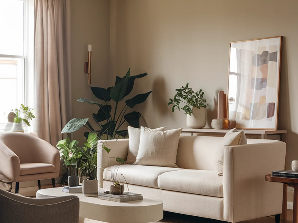
Living Room
In the living room, warm neutrals can create a cozy yet sophisticated atmosphere. Start with a warm neutral base for your walls and layer softer tones in your furnishings. Think plush sofas in taupe or beige paired with accent pillows in deeper earthy tones. Incorporate natural elements such as wooden coffee tables or rattan chairs to enhance the warmth of the space.
Bedroom
For the bedroom, warm neutrals can help establish a serene and restful retreat. Opt for soft beige or pale taupe walls that create a calming backdrop. Layer your bedding with various textures, such as a knitted throw or velvet pillows, to add depth. Consider adding dimmable lighting options to enhance the tranquil atmosphere during the evening.
Kitchen
In the kitchen, a warm neutral palette can make the space feel inviting and functional. Choose warm gray cabinets paired with a creamy white countertop for a timeless look. Accentuate with warm metallic finishes, like brushed gold or bronze, for hardware and fixtures. Incorporating natural wood elements, such as open shelving, can also enhance the inviting feel of the kitchen.
Bathroom
Creating a spa-like ambiance in your bathroom is easy with warm neutrals. Soft beige or light taupe walls can evoke a sense of relaxation. Use warm wood tones for cabinetry and incorporate plush towels in warm hues. Adding greenery, such as potted plants or herbal arrangements, can bring a fresh touch while complementing the warm palette.
Enhancing Your Warm Neutral Palette with Textures and Patterns
Textures and patterns are essential in elevating a warm neutral color palette. They add visual interest and keep the space from feeling flat. Integrating various textures—such as wood, fabric, and ceramics—can create a dynamic environment. For instance, a woven basket, a soft rug, and a sleek wood table can harmonize beautifully within a warm neutral space.
Patterns can also play an important role. Consider using patterned textiles like curtains or throw pillows that feature subtle designs in warm tones. Geometric patterns or delicate florals can add a contemporary flair while remaining cohesive with the overall aesthetic.
When layering textures, think about how different materials can interact. A soft, fluffy rug can contrast beautifully with a smooth wooden floor, while a chunky knit throw can enhance the coziness of a sleek leather sofa. By thoughtfully layering textures, you can create a warm, inviting atmosphere that feels rich and lived-in.
Lighting Considerations for Warm Neutral Spaces
Lighting is a key factor in the perception of warm neutral colors. The type of lighting you choose can influence how colors appear and how the overall ambiance of the space feels. Natural light is the most flattering, highlighting the warmth of your chosen palette. Large windows or strategically placed mirrors can help maximize natural light, enhancing the inviting atmosphere.
Different types of artificial lighting also have varied impacts. Ambient lighting provides general illumination, while accent lighting can highlight specific features or areas. Consider installing dimmable light fixtures to adjust the mood based on the time of day or occasion. Warm-toned bulbs can enhance the golden hues of your palette, creating a cohesive and inviting glow.
Window treatments also play a critical role in lighting considerations. Light, sheer curtains can filter sunlight while maintaining privacy, allowing you to enjoy the natural light without overexposing your warm neutral tones. Alternatively, heavier drapes can create a dramatic effect and offer insulation, which is particularly useful in colder seasons.
Accessorizing with Warm Neutrals
Accessorizing is crucial in reinforcing your warm neutral color palette. Thoughtful decor elements can enhance the overall aesthetic and add personal touches to your space. When choosing artwork, rugs, and accessories, look for pieces that incorporate warm neutral tones or subtle patterns that complement your base colors.
Plants and greenery can significantly impact warm neutral spaces, bringing a touch of nature indoors. Consider incorporating various plants, such as ferns or succulents, in warm-toned pots that harmonize with your palette. The vibrant greens of plants can contrast beautifully with warm neutrals, adding life and freshness to your decor.
Maintaining a clutter-free environment is vital to enhance your ambiance. Opt for a few statement pieces rather than overwhelming the space with too many accessories. This approach allows your warm neutral colors to shine and creates a serene and organized atmosphere where you can truly unwind.
Maintaining a Timeless Warm Neutral Aesthetic
One of the significant advantages of embracing a warm neutral color palette is its timeless appeal. Unlike trend-driven colors, warm neutrals have longevity in design, making them a wise investment for your home. They provide a classic backdrop that can easily adapt to evolving styles, allowing you to refresh your space without a complete overhaul.
To keep your warm neutral palette feeling fresh over time, consider incorporating seasonal decor or unique accents that reflect your personality. Swap out throw pillows, art pieces, or decorative items to introduce new colors or textures while maintaining the overall warmth of your space.
Personalization is key in creating an environment that truly feels like home. Use unique decor items, such as travel souvenirs or handmade crafts, to tell your story and add character to your warm neutral aesthetic. Remember, balance and harmony are essential; while you can experiment with new elements, ensure they complement your existing palette for a cohesive look.
Conclusion
Embracing a warm neutral color palette can significantly enhance your home’s ambiance, providing a foundation of comfort and tranquility. By thoughtfully selecting and incorporating warm neutrals throughout your spaces, you can create an inviting atmosphere that reflects your personal style.
As you embark on this journey of transformation, remember to experiment with textures, patterns, and lighting to amplify the warmth in your home. Personal touches will make your space uniquely yours. So, gather your ideas, paint those walls, and create a sanctuary that welcomes you and your loved ones with open arms.
Frequently Asked Questions
What are warm neutral colors?
Warm neutral colors are shades that combine the qualities of neutral tones with warm undertones. Common examples include beige, taupe, soft gray, and creamy white. These colors evoke a sense of comfort and warmth, making them perfect for creating a welcoming ambiance in your home.
How do I choose the right warm neutral color for my space?
Selecting the right warm neutral color involves considering existing furnishings and the lighting in your space. Test paint samples on your walls in different lighting conditions to see how they appear throughout the day. Pay attention to undertones, as they can greatly affect how colors interact with other elements in the room.
Can I pair warm neutrals with other colors?
Absolutely! Warm neutrals pair beautifully with a variety of colors. Consider using accent colors like dusty blue or deep green to add depth and interest. The key is to maintain a balance by using different textures and patterns to create a cohesive look.
How can I enhance my warm neutral palette with textures?
Integrating various textures is crucial for enhancing a warm neutral palette. Use materials like wood, fabric, and ceramics to create a layered look. For instance, a knitted throw on a leather couch or a fluffy rug on a hardwood floor can add visual interest and warmth.
What lighting works best for warm neutral spaces?
Natural light is ideal for warm neutral spaces as it highlights the warmth of the colors. For artificial lighting, opt for warm-toned bulbs and consider using dimmable fixtures to adjust the mood. Layer different types of lighting, including ambient and accent, to create a well-lit and inviting atmosphere.